Timeframe
Feb - Sep, 2023
UX Outcome
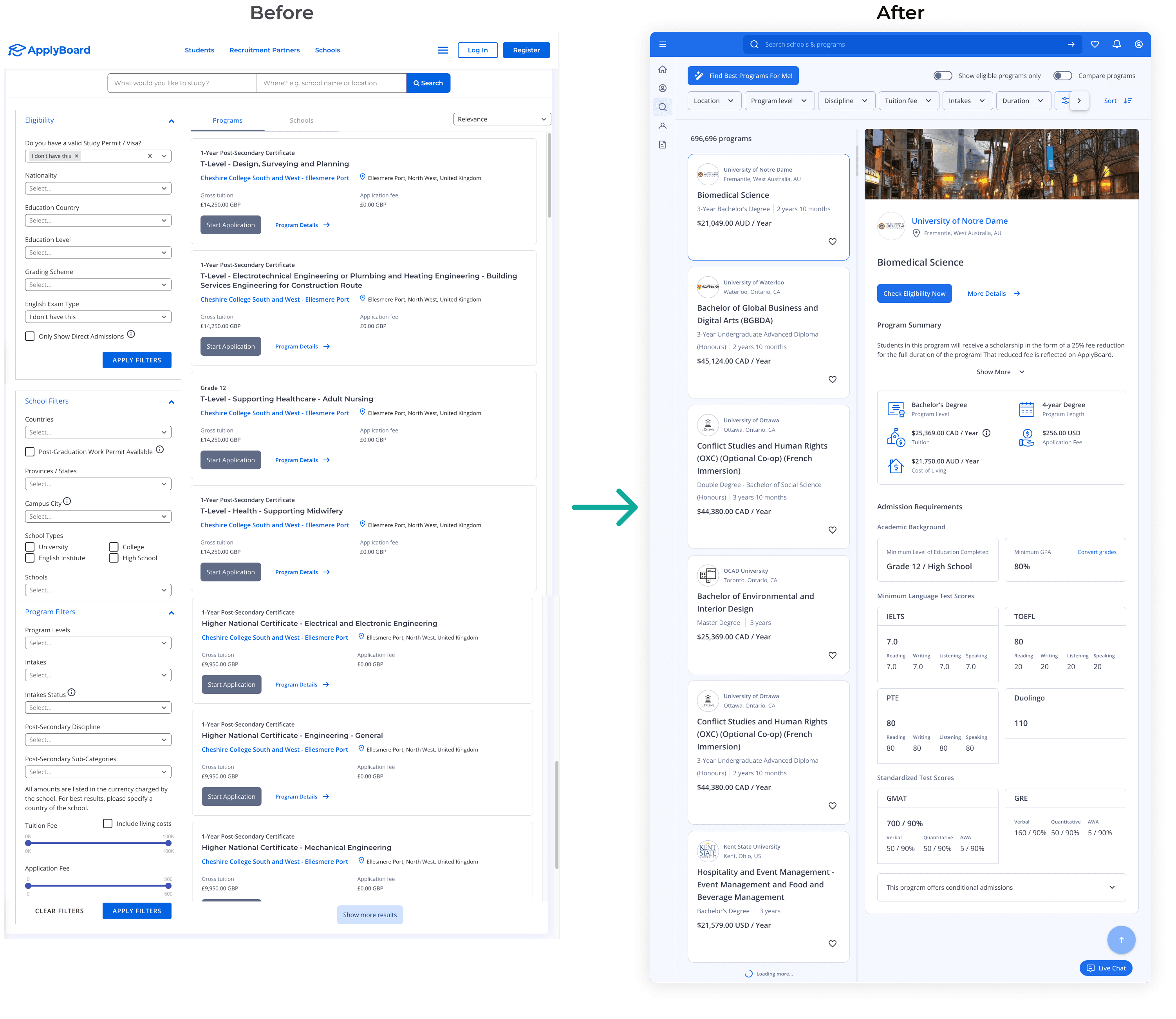
A more intuitive and appealing search experience for students of all types.
Impact
43% increase in monthly active users in 6 months
1.5x faster in finding the right programs
My Roles
UX Researcher and Product Designer
My Team
1 Product Manager, 1 Product Owner, 3 Devs, 1 QA
Final design
→
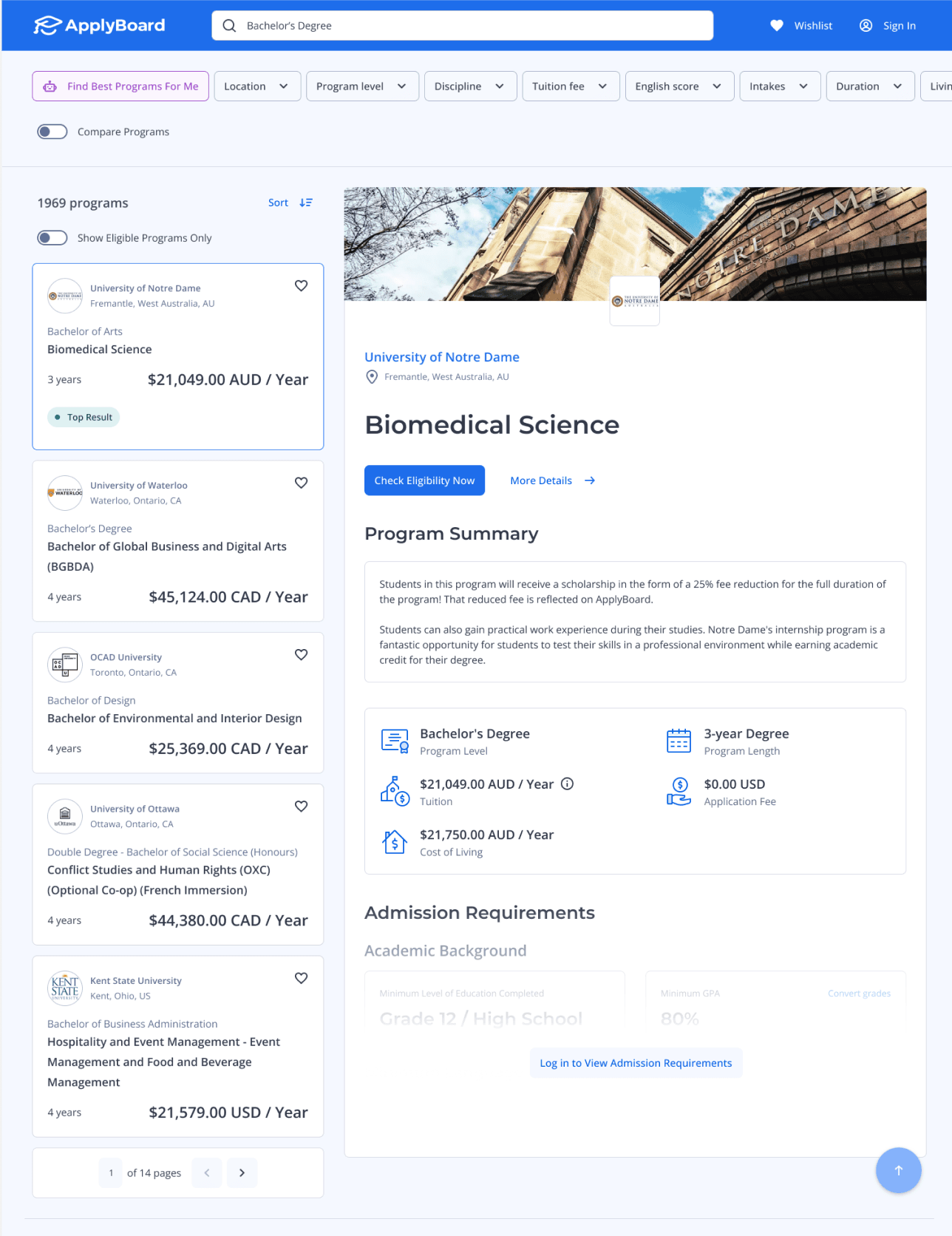
Started with a usability test, found out 2 major pain points
To evaluate the usability of our existing search page, I conducted moderated usability testing with a group of 10 students and discovered two prominent points of friction:
😵💫
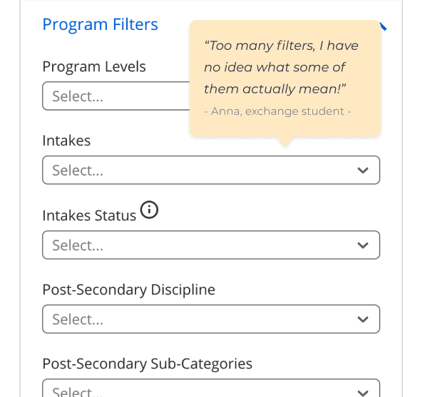
Overwhelming Filters
9 out of 10 students found the filters overwhelming and struggled to determine which ones were most crucial to search.
😥
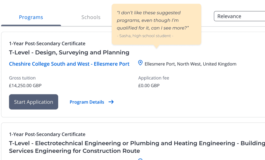
Difficulty Finding Suitable Programs
8 out of 10 students faced challenges in identifying programs that both interested them and met their eligibility criteria.
Did another quick survey, discovered users' priorities
To gain insights into the criteria students prioritize when searching for study abroad programs, I conducted a brief survey with my research team and discovered a comprehensive list of their decision-making factors.

Top 3 factors that affect study abroad decisions: Program Level, Eligibility Criteria, Tuition
Based on all of this research above, I pinpointed the key issues and established my expected UX outcomes.
Desired UX Outcomes
Simplified Search
Design a streamlined layout that enables students to initiate their search quickly by highlighting prioritized filters.
Enhanced Program Visibility
Ensure students can easily identify the right programs for which they are eligible and interested in.
When my team was reluctant to do it...
Back then, convincing my team to dive into layout changes wasn't a walk in the park.
Limited resources and pressing deadlines made them a bit cautious. They were all about recycling existing stuff to keep things simple, making a new and bold layout change a bit of a tough sell! 🥲
My challenge here, therefore, was to find that sweet spot where our development team's preferences meet our users' needs.
I proposed a layout voting process
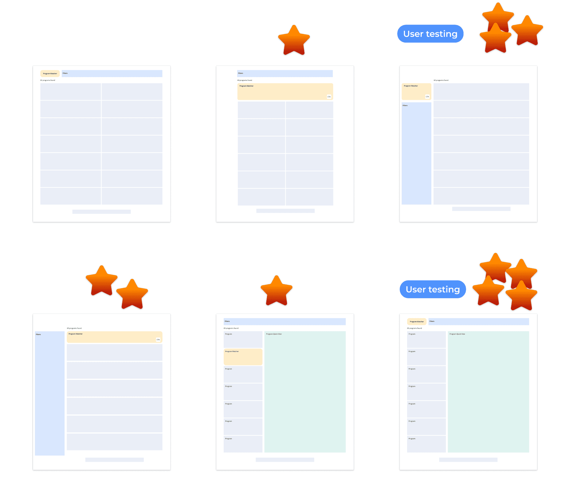
I created 6 different layout ideas, allowing team members to weigh in and narrow down the options to 2.
And the “battle” between 'Quick View' and 'List View’ began! ⚔️
and explored two wireframe concepts
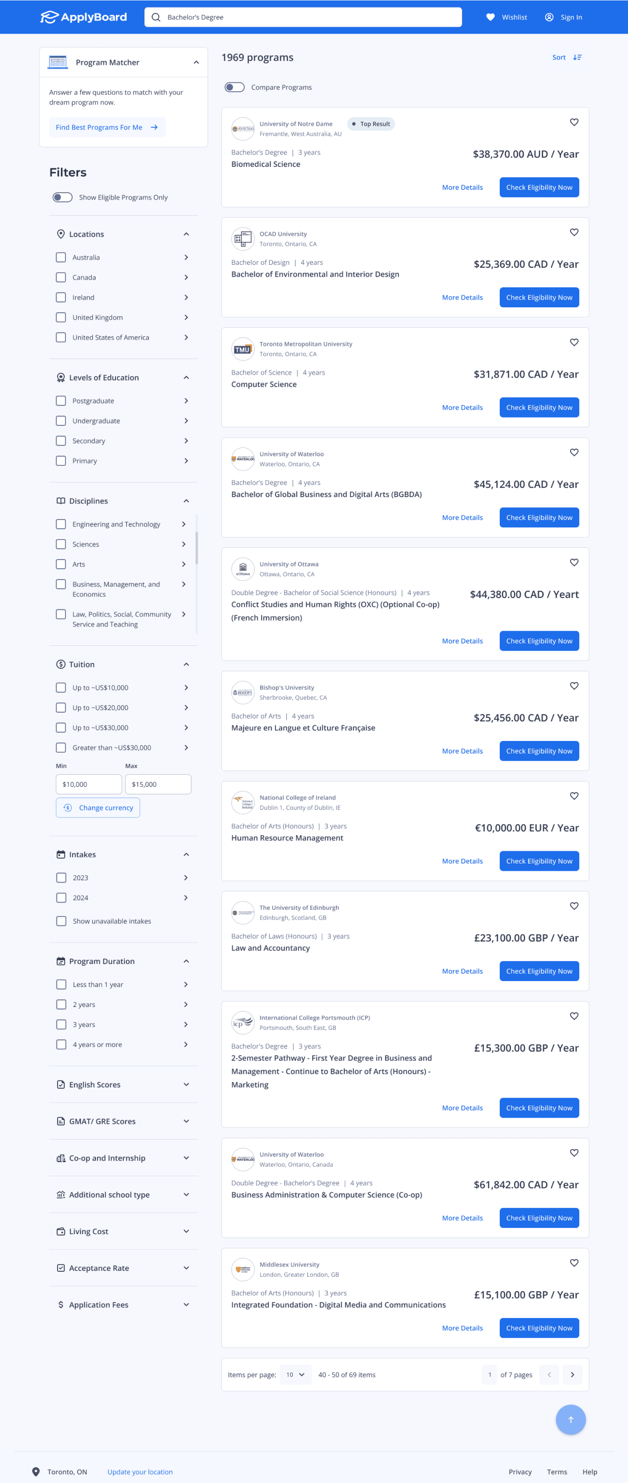
List view
Pros: Left-side filters improve the ability to find key options.
Cons: Viewing program details requires students to navigate to a different tab.
Quick view
Pros: Program details shown on the same page, saving clicks to switch tabs.
Cons: Requires many clicks and scrolls to view each filter.
Torn between the two concepts, both of which I liked, I decided to rely on the voice of users by conducting a comparison usability test to see which one is more preferred.
Testing result
‘Quick view’ won by a narrow margin!
By running a test, I found out:
8 out of 15 participants preferred 'Quick View' for its seamless program details display without the need for a new page load.
The rest appreciated 'List View' for its extended filter options, offering helpful hints.
Though 'Quick View' had a slight edge in popularity, 'List View' demonstrated value, especially as it aligned with our team's perspective.
Design decision
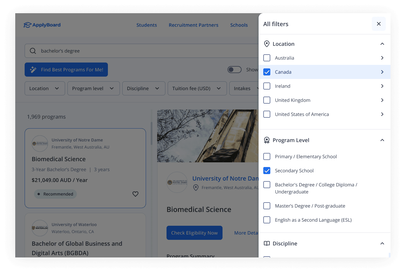
Enhanced 'Quick View' with integrated 'List View' filters
Choosing to blend the strengths of both layouts, in the final version, known as 'Quick View,' I integrated the 'List View' as an advanced filters side panel.
Added new toggle for better program recommendation
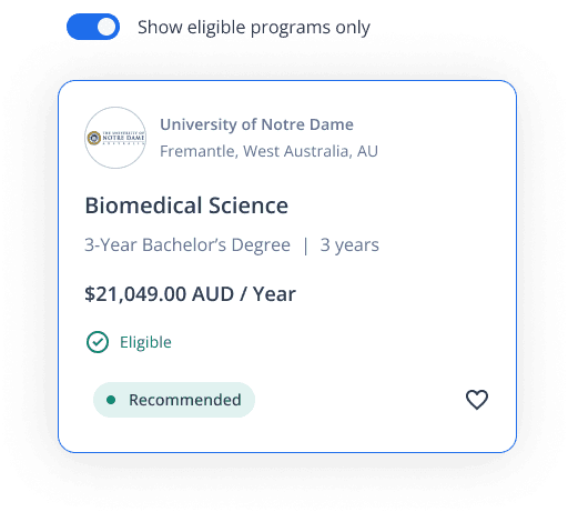
To further enhance the user experience and address the second users’ pain point, I added a toggle button to highlight eligible programs and a checkmark to indicate a student's eligibility status.
Miscalculation of the number of variants!
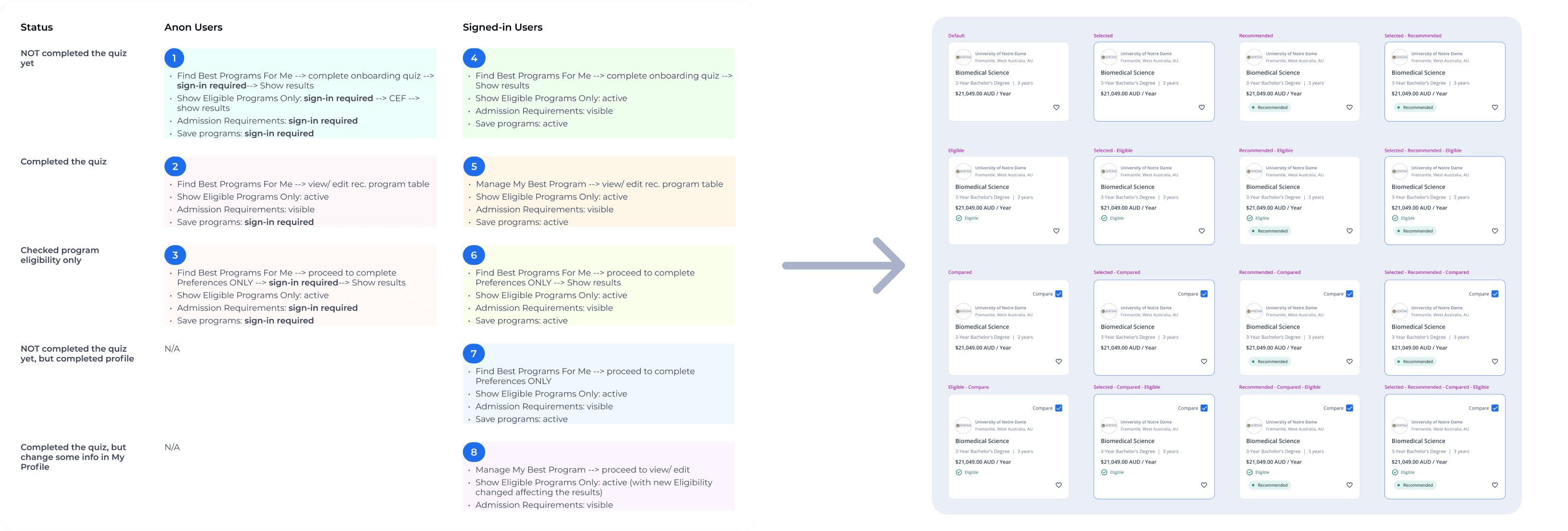
Based on feedback from our student support and development teams, I created 8 different scenarios for both signed-in and anonymous users. I handed them over to our dev team feeling confident I covered everything.
But then things got tricky. I realized each scenario had various elements that slightly changed the program cards on the search page due to different entry points and filters. It turned out we were missing 8 variants!
Just when I found out about the issue, the design was already handed over, and our dev team was halfway through the project. Adding more variants meant more meetings with the UI engineering team because some of the new variants' behaviours weren't developed yet.
8 main user flows and 16 variants for the program cards
Eventually, I came up with an additional set of a total of 16 variations for these cards, which also caused us a few weeks' delay. After another over 13 rounds of back-and-forth meetings, we finally reached the ultimate final prototype version.
Our process in a nutshell
Measured our design solution
To validate the effectiveness of our redesign, we conducted testing with the same groups of students who had participated in earlier phases. Their feedback was overwhelmingly positive, reflecting high satisfaction with the new layout.
86%
1.5x
Faster completion in finding program task
20%
Rise in post-registration conversion rate.
I assembled all mockup screens to create a prototype, handed it over to our development team, and assisted as a part-time QA until it was launched.
Checking everything everywhere all at once
During the ideation phase, I made a mistake by not thoroughly checking the entry points of each flow. This led to delays in the timeline as I had to create more UI variants than anticipated. I learned that because everything was interconnected, changes in user flows easily impacted the scenarios of each UI.
When you forget to consider one scenario
Involving the full development team early in the design process
Initially, as the sole designer, I worked independently until the ideation stage, which led to conflicts over layouts without consensus. To address this, I decided to involve developers in the voting process, ensuring consideration of backend logic and development capacity.
This approach fostered better communication between designers and developers, enhanced understanding of user needs, and promoted empathy beyond code focus.
If this catches your interest, please reach out for a detailed walkthrough, I’m just one email away! 😊
