Another project I did a while ago for ApplyBoard, a platform that students visit to search for programs or schools they wish to study abroad, and submit applications here.
I took on the challenge of revamping the student dashboard, which was causing frustration with its confusing layout and lack of direction.
Divided into two phases: Phase 1 focused on revamping the original navigation and providing clearer next-step instructions. As for Phase 2, which came later, the focus shifted to delving deeper into refining step guidance and making the application process smoother.
Phase 1 | Revamp*
Process
*This case study outlines the design approach for Phase 1. If you're interested in learning about our progress in Phase 2, feel free to get in touch with me for additional details :)
When this project began, there were not many significant reports and reviews about the existing dashboard.
The inside sales team noticed a big 50% drop in conversions after the 'account created' stage. The student support team shared that the post-login process wasn't easy, leading to more support work and higher costs.
However, none of these speculations have solid data to support them. Therefore, I started delving deeper to learn more.
I started with insights from past research
Initially, I aimed to conduct usability testing to validate this assumption. However, given the time constraints of the project, I turned to past user research to help shape the problem statement.
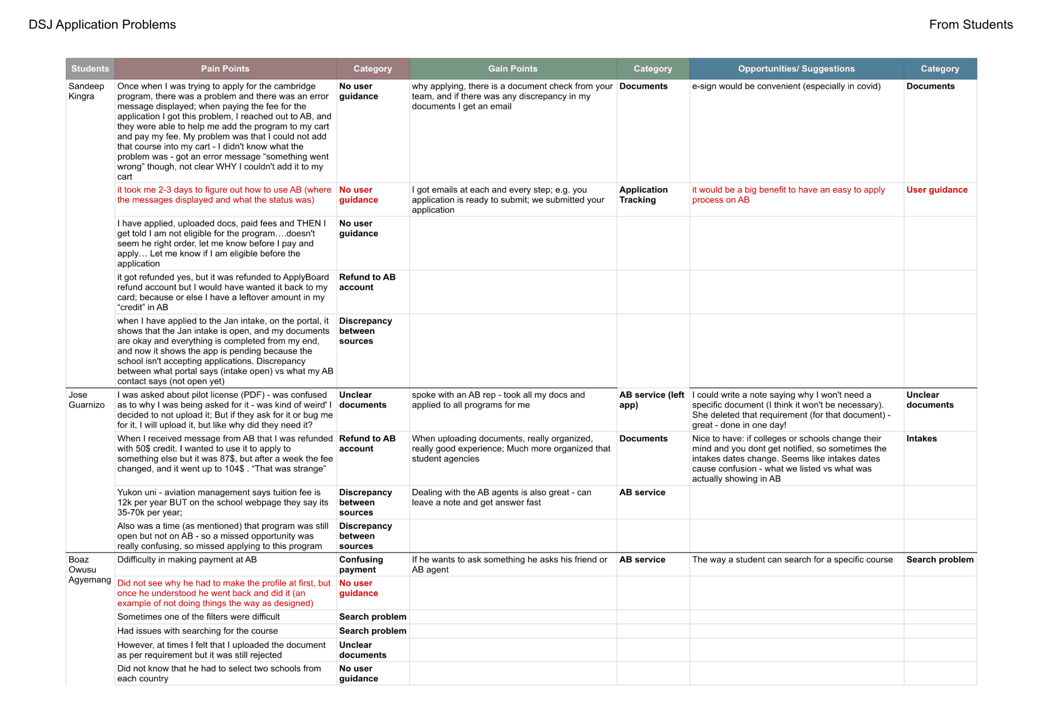
From this existing research I discovered that after signing up, many new users took a lot of time to figure out their next steps.
Past research on students’ pain points and gain points during their application journey
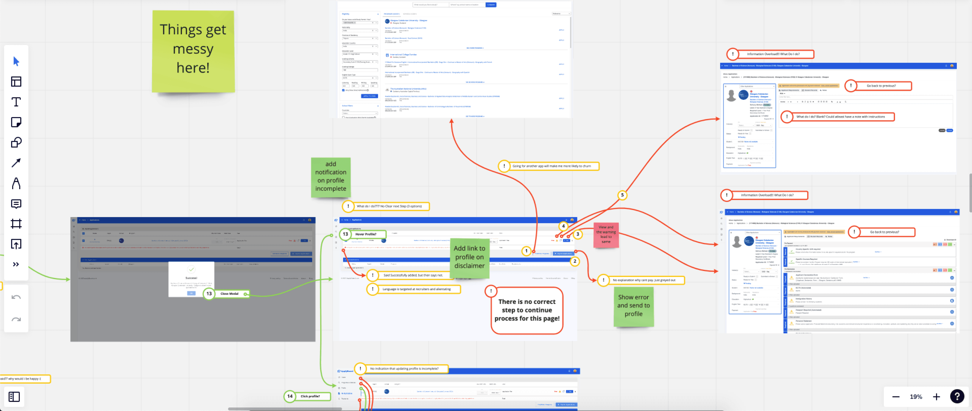
and a UX audit session
I worked with my PM to review the existing flow to pinpoint specific issues.
The audit revealed a notable deficiency in guidance and effective onboarding for new users after the signup stage, resulting in confusion among this demographic.
Past research + UX Audit = Problem
Problem
“As a student, I don’t know what to do after I register with ApplyBoard.
Therefore, I need a way to see where I am in the process and what to do next at any given points, so that I can easily follow then advance towards my goal of applying for a program.”
Desired UX Outcome
At any point in their journey after registration, a student is aware of where they are in the process, and what their next step is.
Scope alignment
After setting our goal, we met with our key stakeholders to lay out the tasks for the first phase and specify its main uses. We collectively agreed that a redesign of the dashboard page, the initial touchpoint for new users after they register, was necessary.
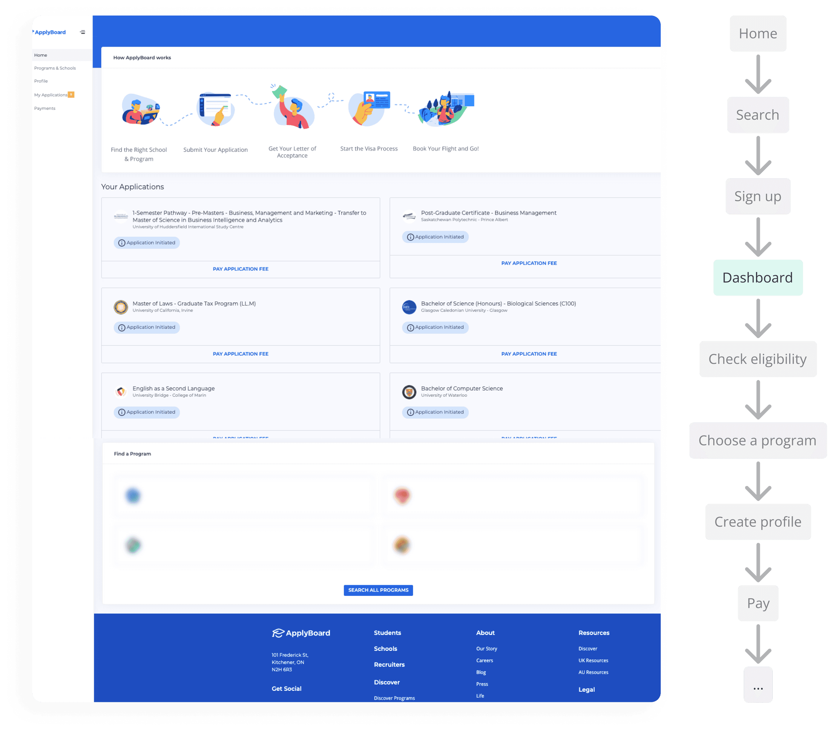
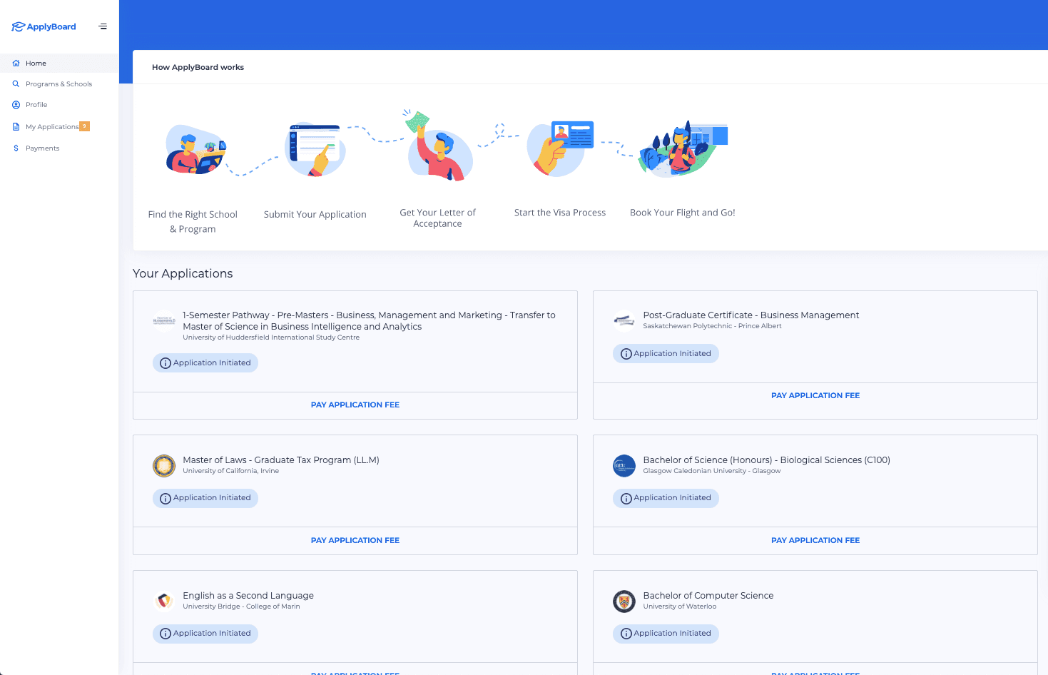
The original dashboard design and where it stands in the application flow
To address this, I arranged a collaborative 2-hour session with the Product Managers (PMs) and developers.
During this session, we brainstormed solutions for the previously mentioned problem and identified essential features while considering limited development resources.
We reached a consensus that our overall solution should encompass two essential components:
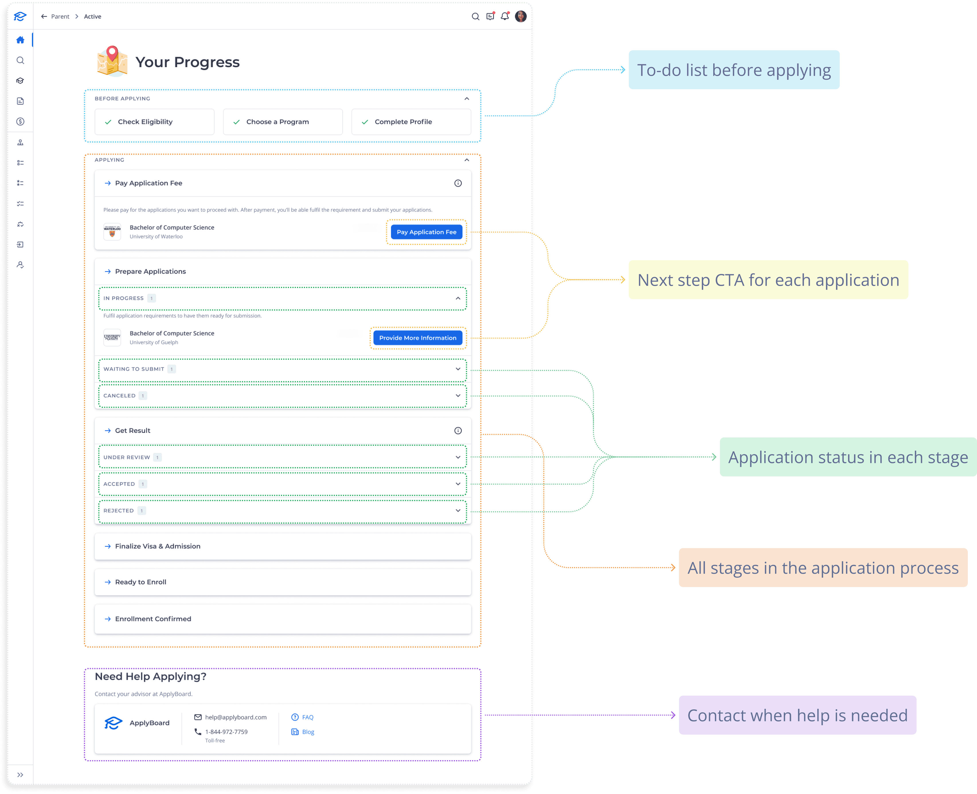
A checklist with a linear step-by-step flow
A progress tracker that shows application status
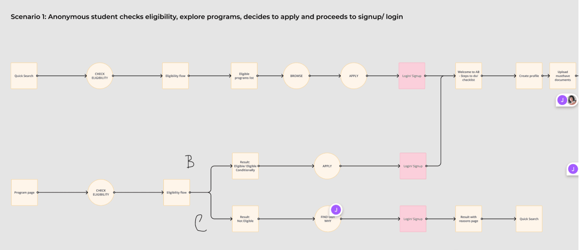
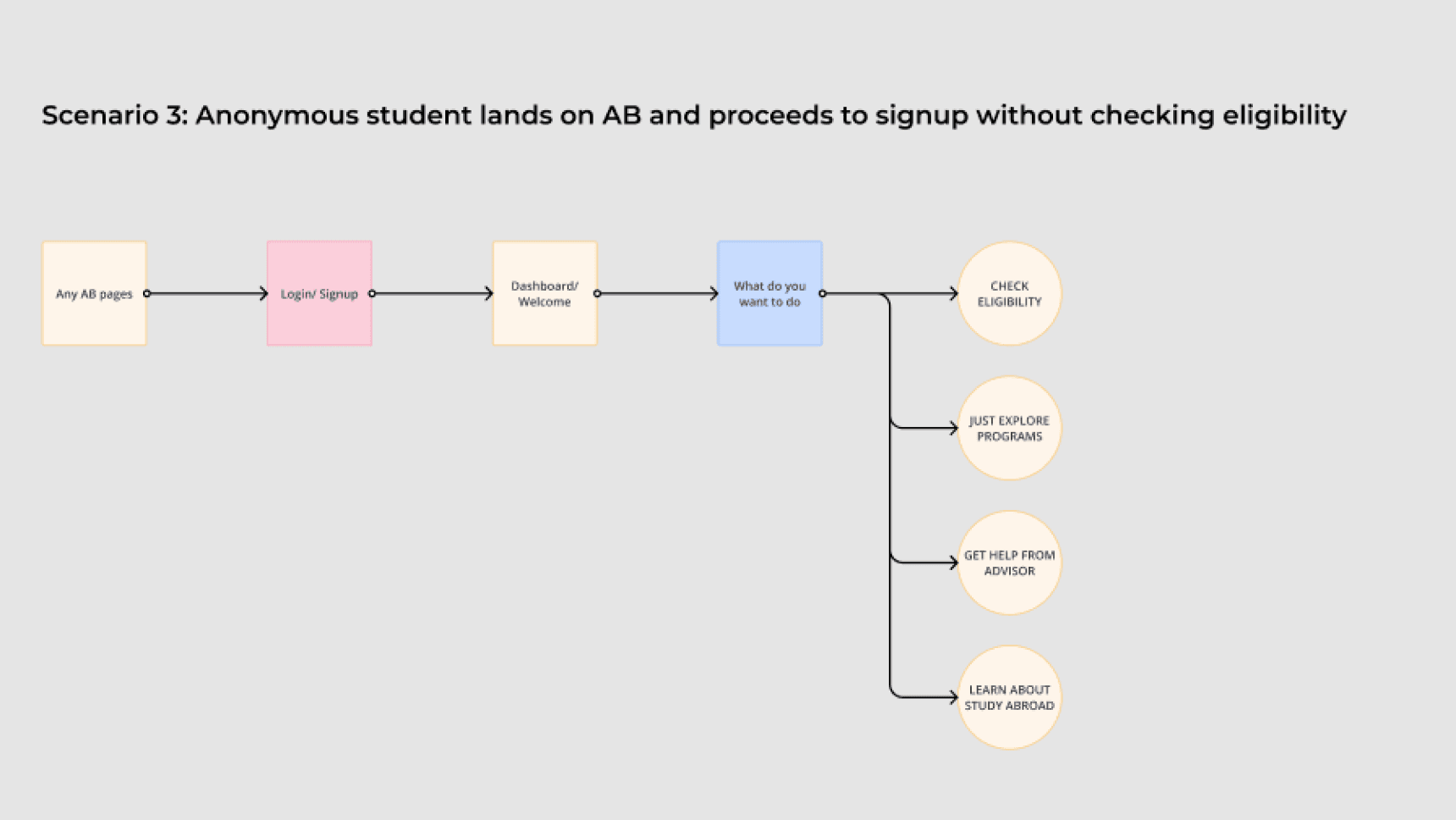
and came up with 3 possible scenarios
After establishing the scope from insights gained in our discovery sessions, I crafted user flows to cover primary and edge cases.
Identification of potential scenarios
From the sketched ideas and the user flow, I generated the first lofi design and had some re-iteration rounds after getting feedback from the team and other key stakeholders.
First sketch
Simple vertical check list of what to do. Students start the first step at the top of the list.
Re-iteration
I categorized steps based on application requirements; the second part followed only after completing the first
Final
Insights from our sales team revealed users’ inclination for human assistance when unsure.
Hence, I added the 'Need Help' to connect them directly with our advisors.
From our design system, I created the high-fidelity version of the dashboard, which later underwent another whole bunch of review cycles to guarantee alignment with accessibility standards and brand guidelines.
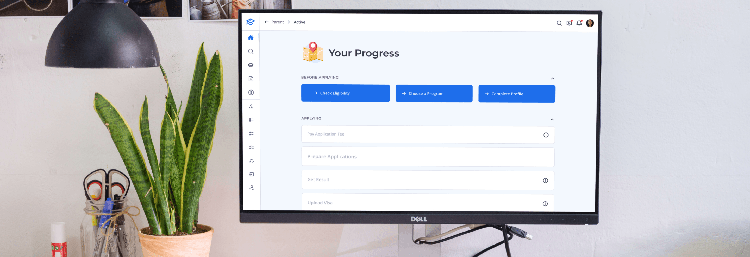
Unlike the old design lacking a linear step-by-step guide, the new dashboard serves as a comprehensive hub for new users. It offers a centralized platform for viewing upcoming tasks and tracking their progress through the application process via the application status tracker.
Before
Original dashboard design
After
New dashboard design
Usability testing
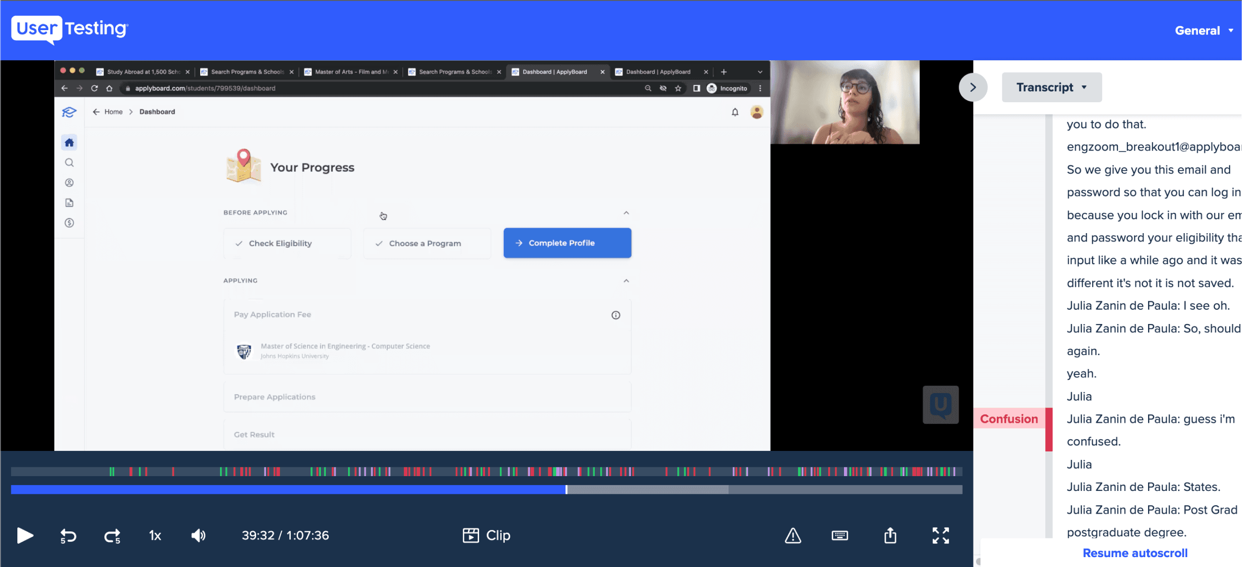
I conducted usability testing sessions using the design prototype to validate the initial issues and assess whether the intended UX improvements were achieved. This marked the first instance of external participant testing.
I interviewed a total of 10 participants, all of whom were international students planning to study abroad and aiming to complete their applications independently.
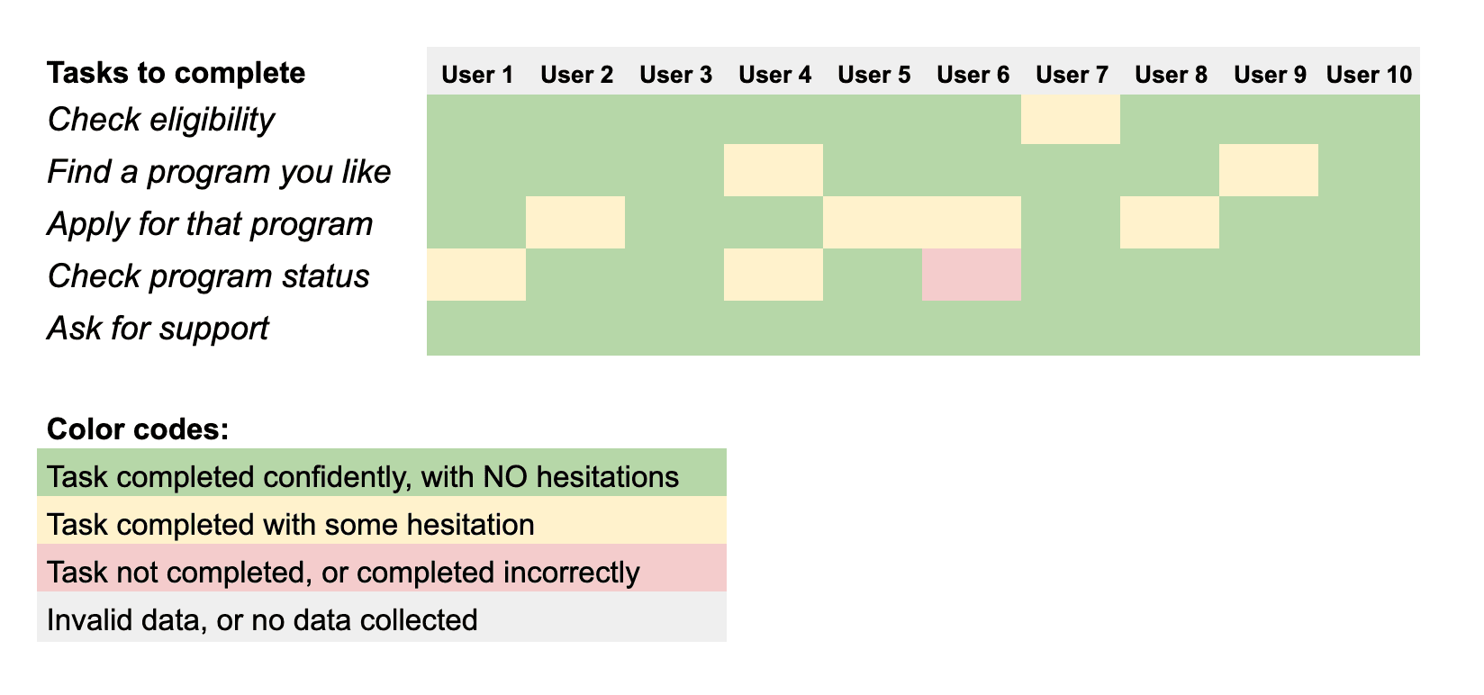
Some of our gains from the test:
80%
Users completed the tasks easily and were able to track their progress
90%
Prefered the new minimal look and knew what step to do next.
Ultimately, we successfully validated 90% of the identified issues and achieved the desired outcome.
Preparation for phase 2
During the testing phase, participants experienced minor confusion, particularly regarding the lack of clear step-by-step progression and detailed descriptions. These concerns were duly noted and will be addressed in the re-iteration phase.
This is the end of phase 1.
If this catches your interest, please reach out, I’m just one email away! 😊
