This case study narrates the journey from problem detection to the launch and planning of our reiteration.
Impact
Drop-off rates were reduced from 50% to 30% post-redesign, suggesting improved user engagement.
UX Outcome
Created a holistic and enjoyable onboarding flow that not only assists users in identifying the right program smoothly, but also enhances their discovery experience.
Timeframe
Aug 2022 - Apr 2023
My Role
UX Researcher and UX/ UI Designer
My Team
1 Illustrator, 1 Marketer, 1 Product Owner, 1 Product Manager, 3 Devs, 1 QA Engineer,
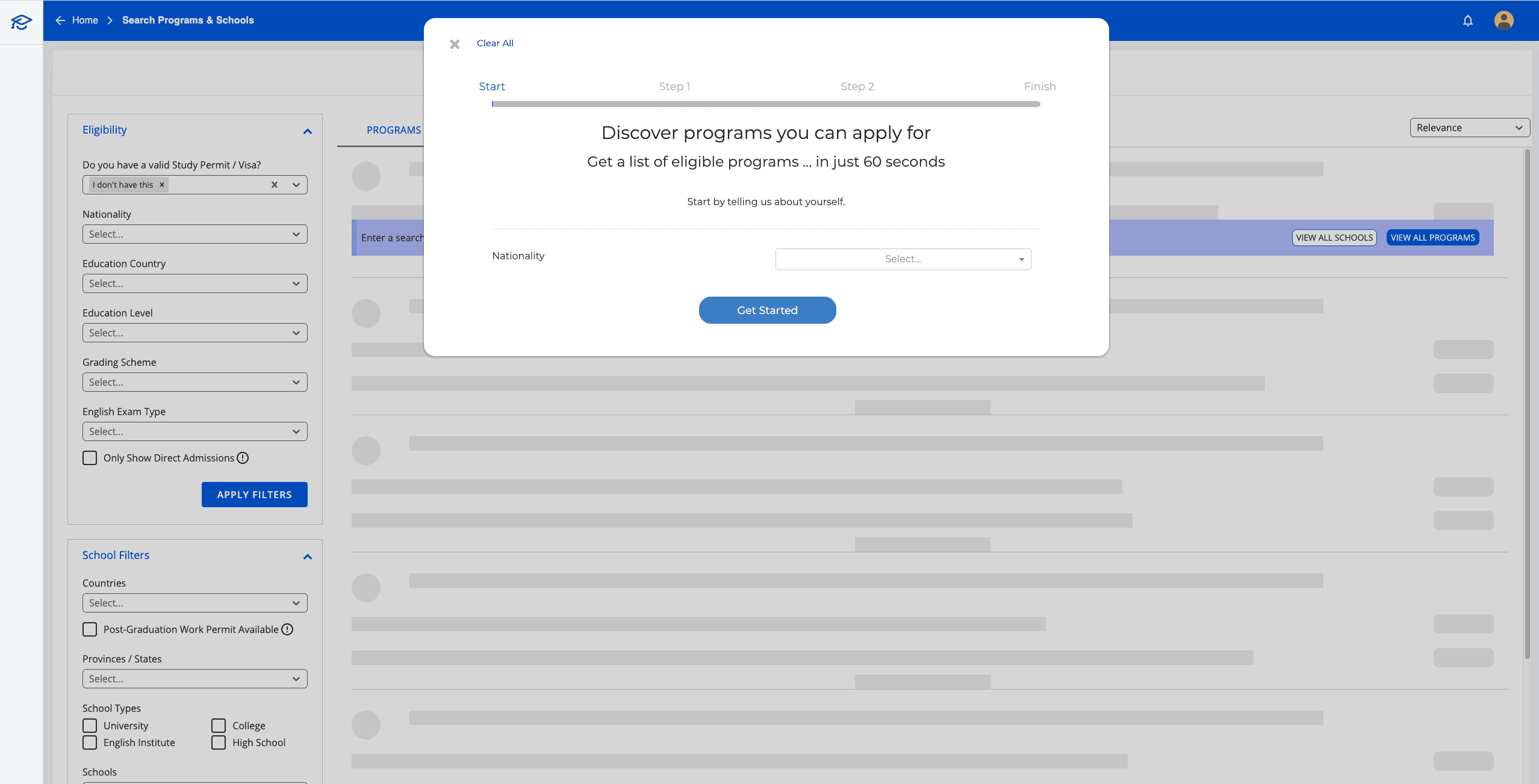
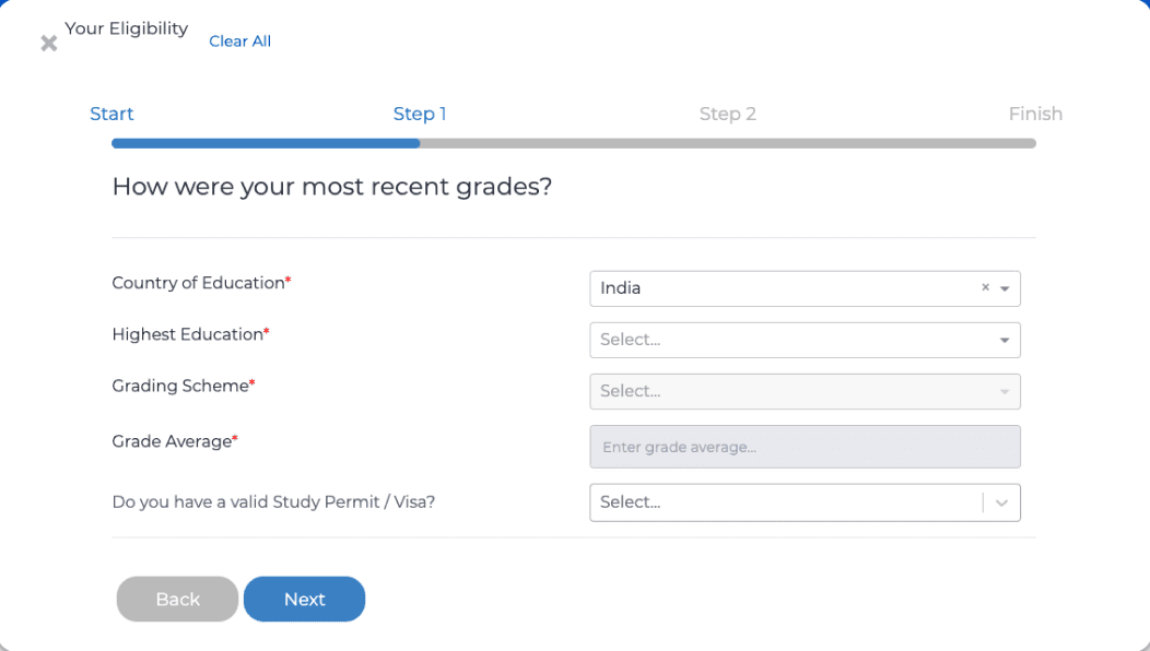
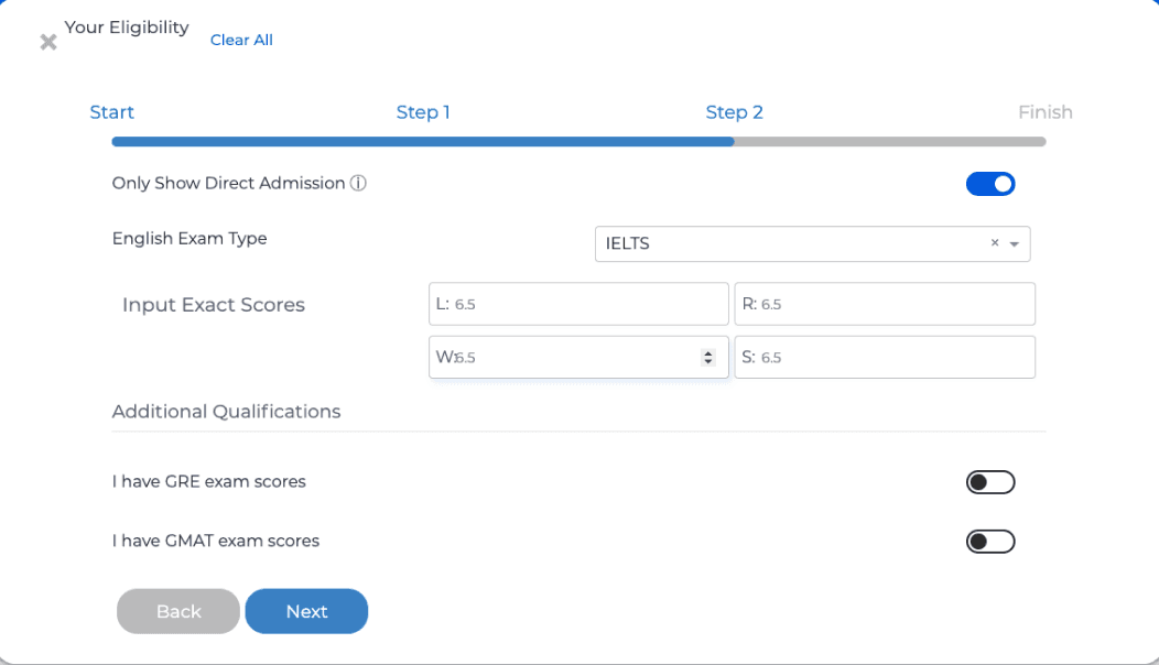
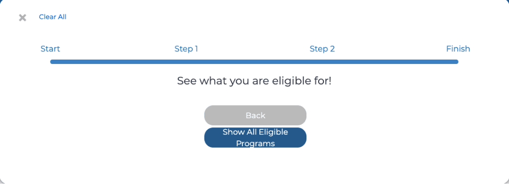
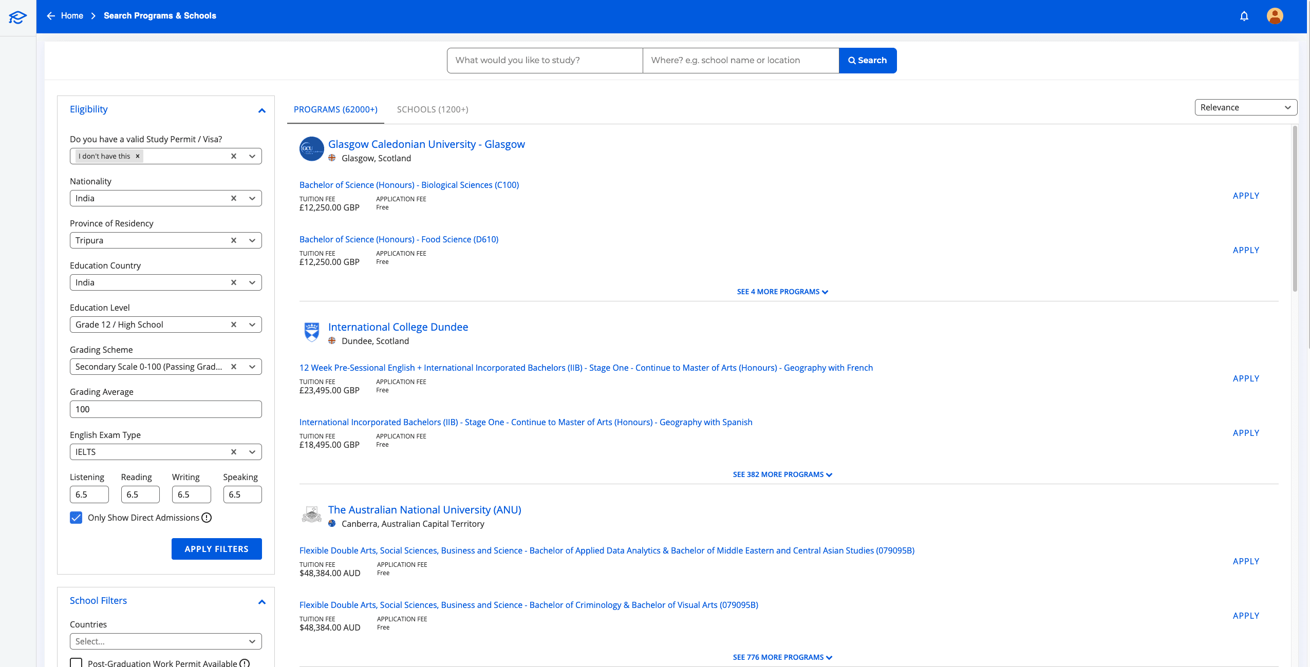
Original "Check Eligibility" flow
Students answer background and education questions.
and the program results
Students then are able to view programs they were eligible for.
CONTEXT
Half of our potential users left during the first step of signing up!
Started with a significant drop off ...
The student onboarding process consists of 4 crucial steps, the logic of which was fully established many years ago. Essentially, the standard flow for an international student applying on our platform looks like this:
Expectation
Each step has its own issues, but the first one, "Check Eligibility" flow, had the most people leaving, as shown by our MixPanel data.
Reality
It was detected that over 50% of users tended to drop off in the middle of the questionnaire!
This Check Eligibility flow had 8 questions about students' backgrounds, like nationality, education history, GPAs, and English skills, to find the best programs for them.
... leading to many assumptions 🤔
May be the questionnaire was too long?
May be the questions were not relevant for international students?
Was the wording difficult for international students to understand?
Or the UI design simply sucked?
I then decided to do a research to test these assumptions and detect further.
RESEARCH
→
PAINT POINTS
The points of friction was way simpler than expected!
I conducted some thorough research
To test those assumptions mentioned above, I decided to conduct two types of research:
💬
To identify the factors that most significantly influence students when searching for a study program abroad.
🧑💻
To investigate the pain points experienced by users during the original check eligibility flow.
and discovered some interesting findings:
May be the questions were not relevant for international students?
Eligibility questions are relevant, but preference ones are missing.
From the problem interview, I asked 10 students to see if they considered those questions relevant to their experience in discovering programs. Guess what? Most of our questions addressed their eligibility concerns, but there are other significant preference factors driving their decision that we missed.
The top factors based on students' preferences include tuition fees, start time, location, field of study, and more.
May be the questionnaire was too loooooong? 🧻
The questionnaire was good, the results were NOT!
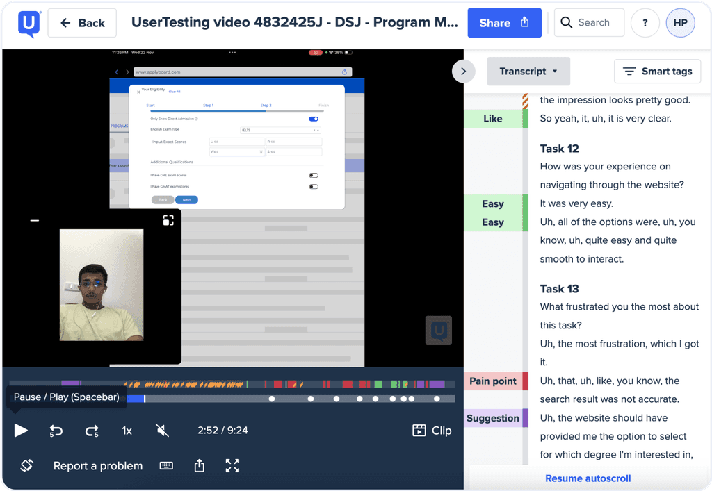
It was revealed during the test that the issue wasn't the questionnaire's length but rather the outcomes of the recommended programs.
One user found the questionnaire "very clear" and navigation "easy and smooth" but felt the results were "not accurate" and "should have offered options I'm interested in".
It turned out that our current eligibility check only provided programs students are eligible for, but it didn't consider their preferences, which was a significant oversight! This led to incorrect results that nobody wanted.
This is what our solution should have offered
May be the UI design actually sucked? 🤷
It actually sucked!
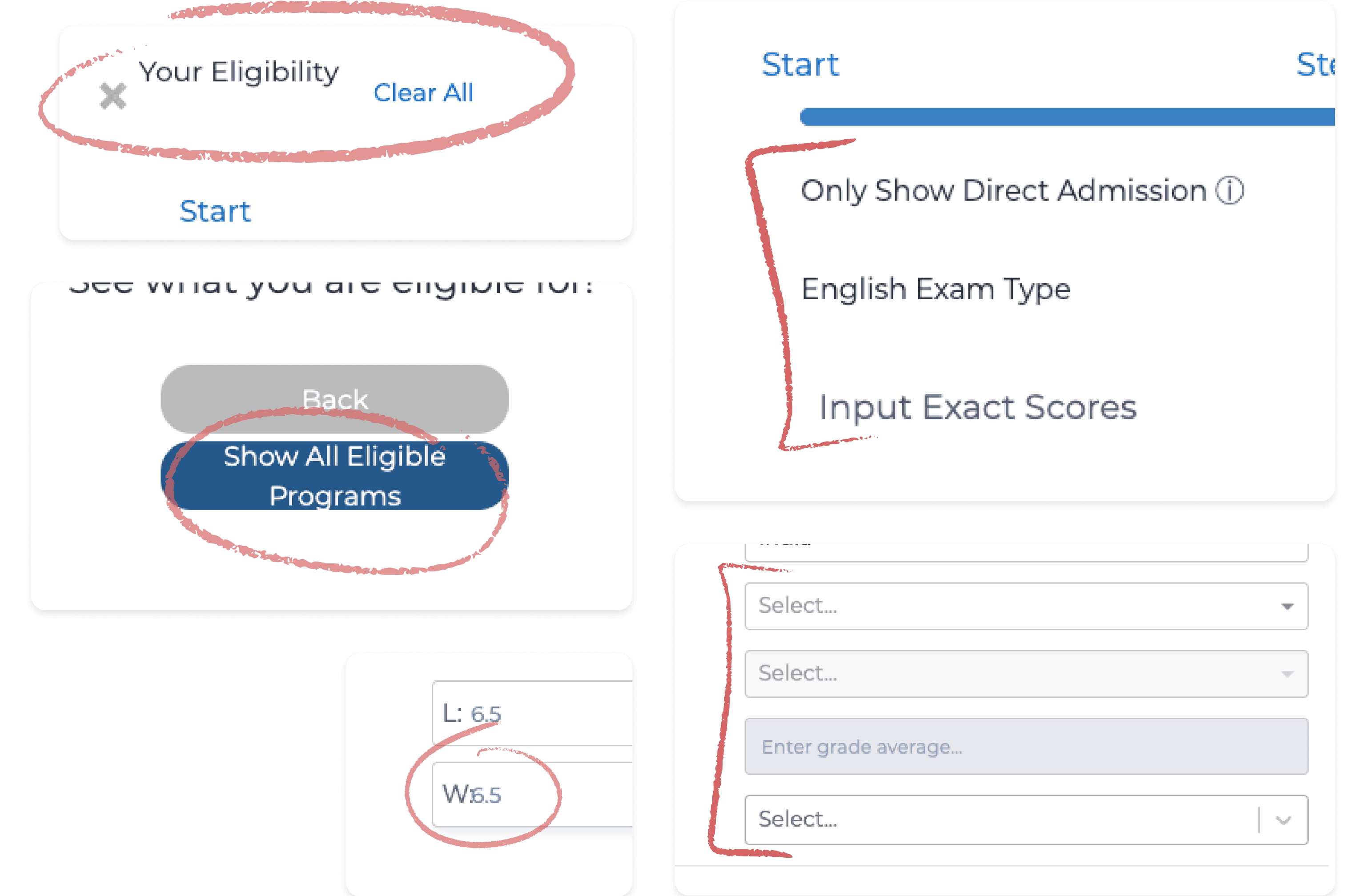
The interface of the original flow was received negative feedback from users, with many expressing that it looked tacky and reminiscent of a scam website. They felt that it lacked credibility and in need of a makeover to improve its appearance and trustworthiness.
Indeed, the original design had various UI bugs, such as inconsistent spacing, line indentation, typography issues, and so on.
→
DESIGN SOLUTIONS
Numerous meetings were scheduled to align user requirements with business priorities.
Business teams wanted to involve in the design process
This interesting onboarding project somehow attracted a lot of attention from other teams, as they expressed interest in contributing additional questions to gain more business results.
While the business team made valid points, their suggestions could potentially disrupt the experience for students who have already invested time in completing the onboarding quiz. Additionally, given the time constraints on this project, I need to commit to our timeline, so I set some meetings to facilitate their involvement.


Our alignment in a nutshell
What they suggested
How I tackled this
📟
Asking for students’ phone numbers
So that our inside sale team can contact them later and help them to apply.
⏳
Delay this until later in the signup process
Requesting their personal info this early, without enough trust, may cause drop-off.
🪤
Adding a mandatory sign-up
At the last question before showing them the program results to get more new registered users.
✂️
Rejected this
Unfair to gate-keep info while immediately requesting their commitment after they already spent 5 mins on the quiz!
🎛
UI touch up
The quiz flow needs to be more visually interesting and user-friendly to keep users.
🪄
Collab with Marketing to enhance this
Again, because obviously the original design sucked 🤷♀️
I developed 2 major design outcomes
Based on my research and stakeholder input, my design solutions were formulated:
Providing more accurate personalized results
By adding preference questions to the quiz, we help students explore more programs that match their eligibility and interests.
Creating a fun, Gen Z-friendly UI
So that students can feel motivated and less overwhelming when applying by themselves.
Illustrations: Blue pack by getIllustrations
IDEATED & REFINED
Redesigning the UI, finalizing content and leading design collaboration
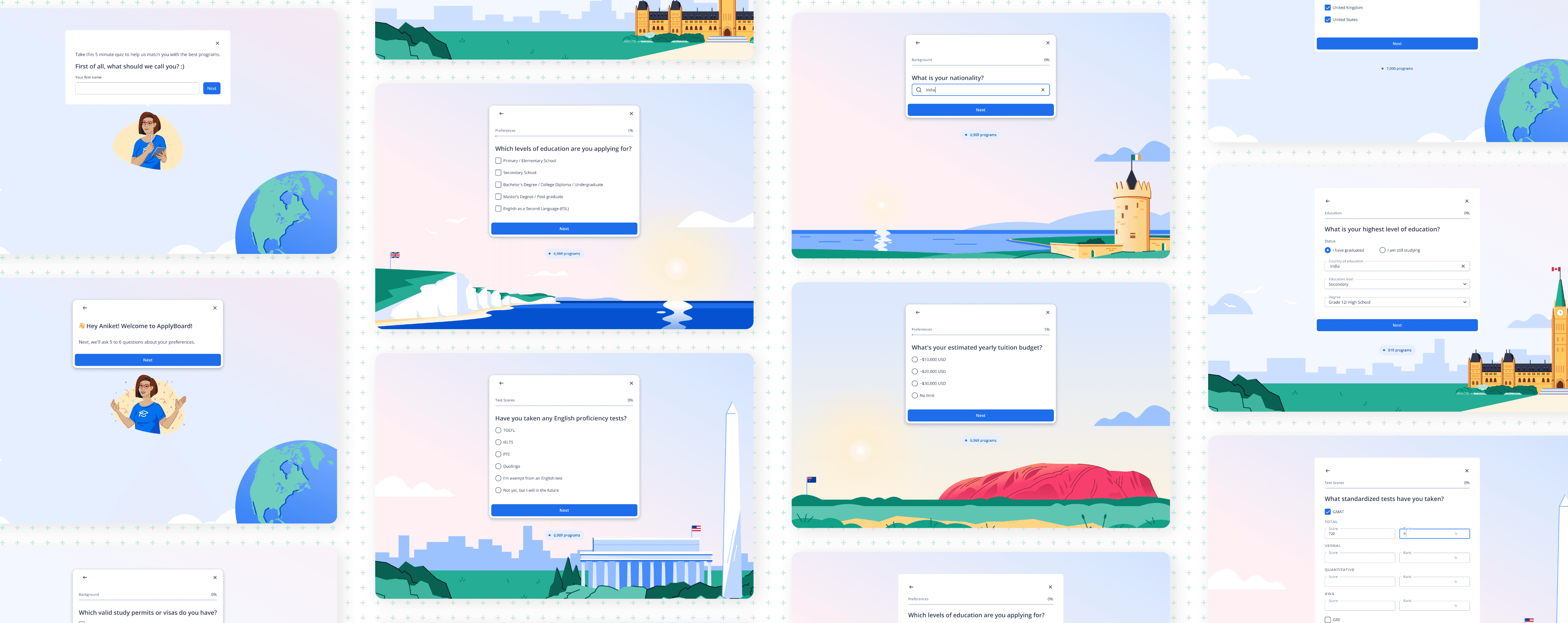
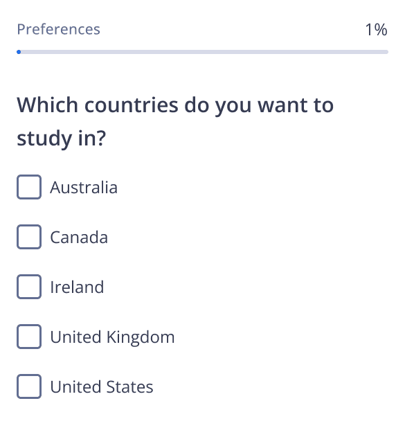
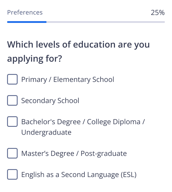
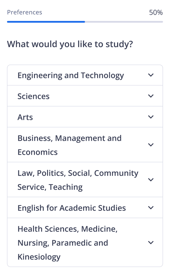
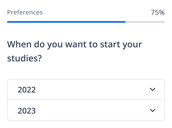
I added preference questions to the onboarding flow
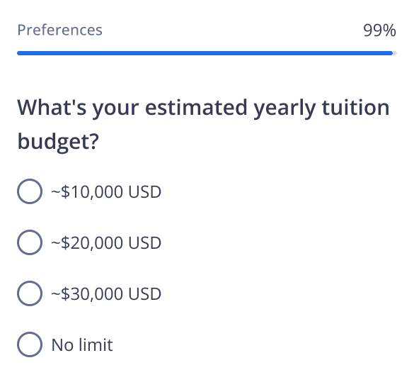
Based on the findings, I added 10 additional questions about students’ interests or preferences to the onboarding questionnaire. Following multiple review rounds with the Student Service teams, I reduced it to 5 preference questions. Eventually, I finalized the onboarding questionnaire with a total of 13 questions, including the eligibility ones.
Five extra questions added to the onboarding flow
And explored some design concepts inspired by popular apps
Initially, I proposed several ideas.
One of them was having a Duolingo-style interactive quest, but it got rejected because it would take too much time for the graphic designers to come up with visuals and for the developers to adjust the backend logic. Besides, we didn't have a mobile app to make the experience smoother.
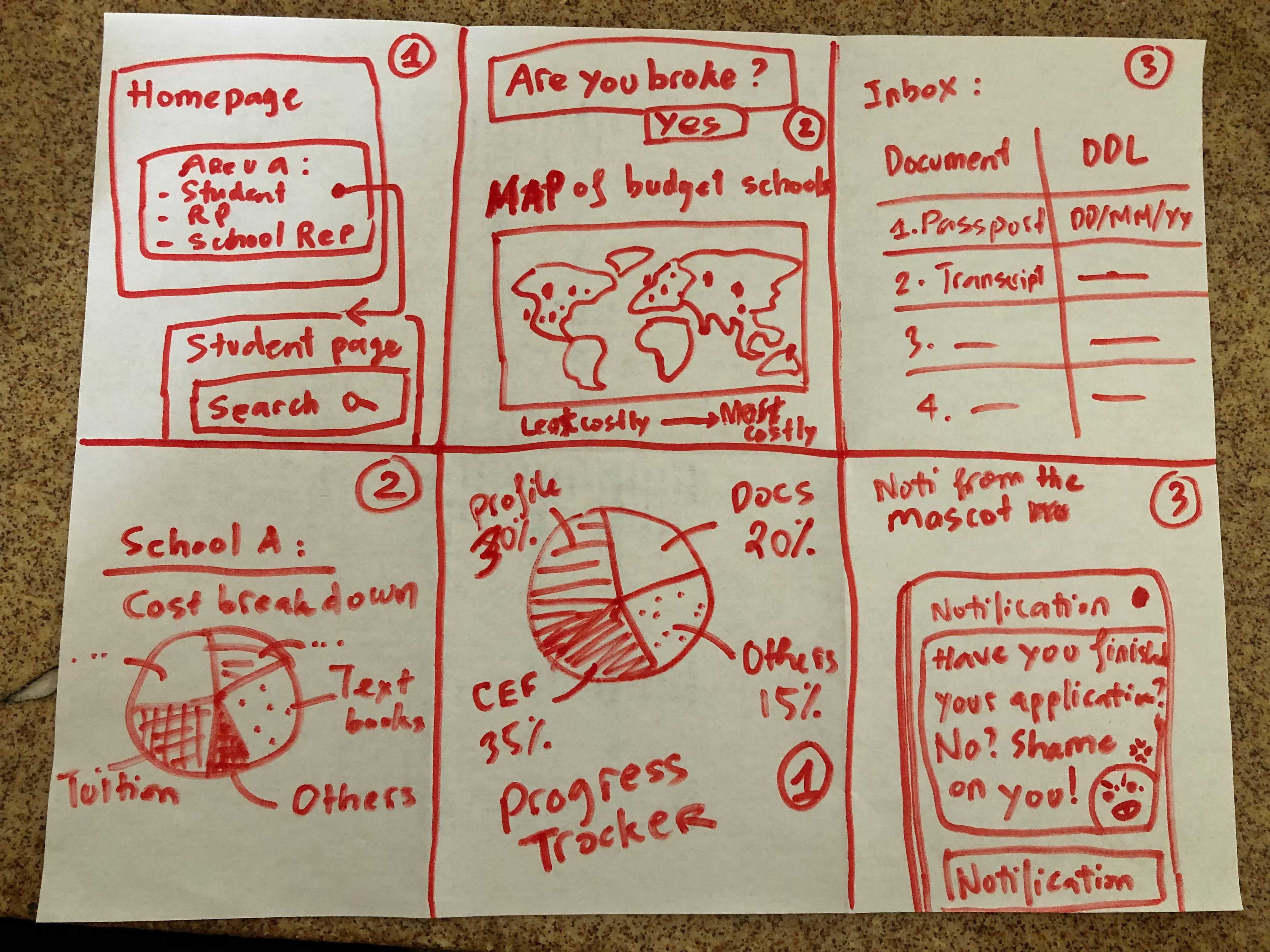
Some of my initial concepts that got rejected
After a few brainstorming sessions with the devs, I realized that the best way to make the flow more enjoyable without changing all the backend logic or delaying development was to focus on the UI. Therefore, I then decided to experiment on changing the questionnaire background, as it was the easiest area to be creative without requiring much development or coding effort.
Then led the design initiative with support from Marketing team
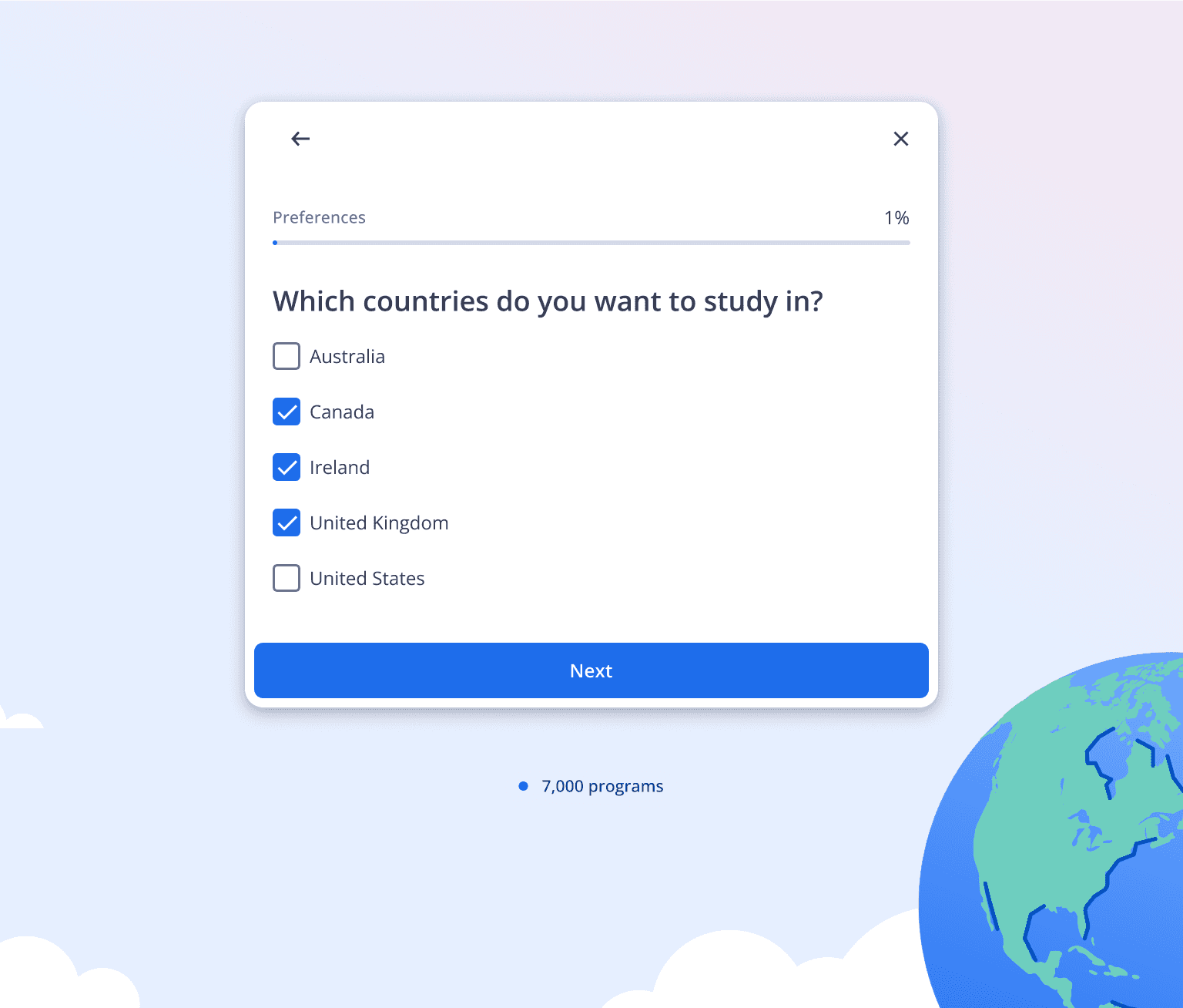
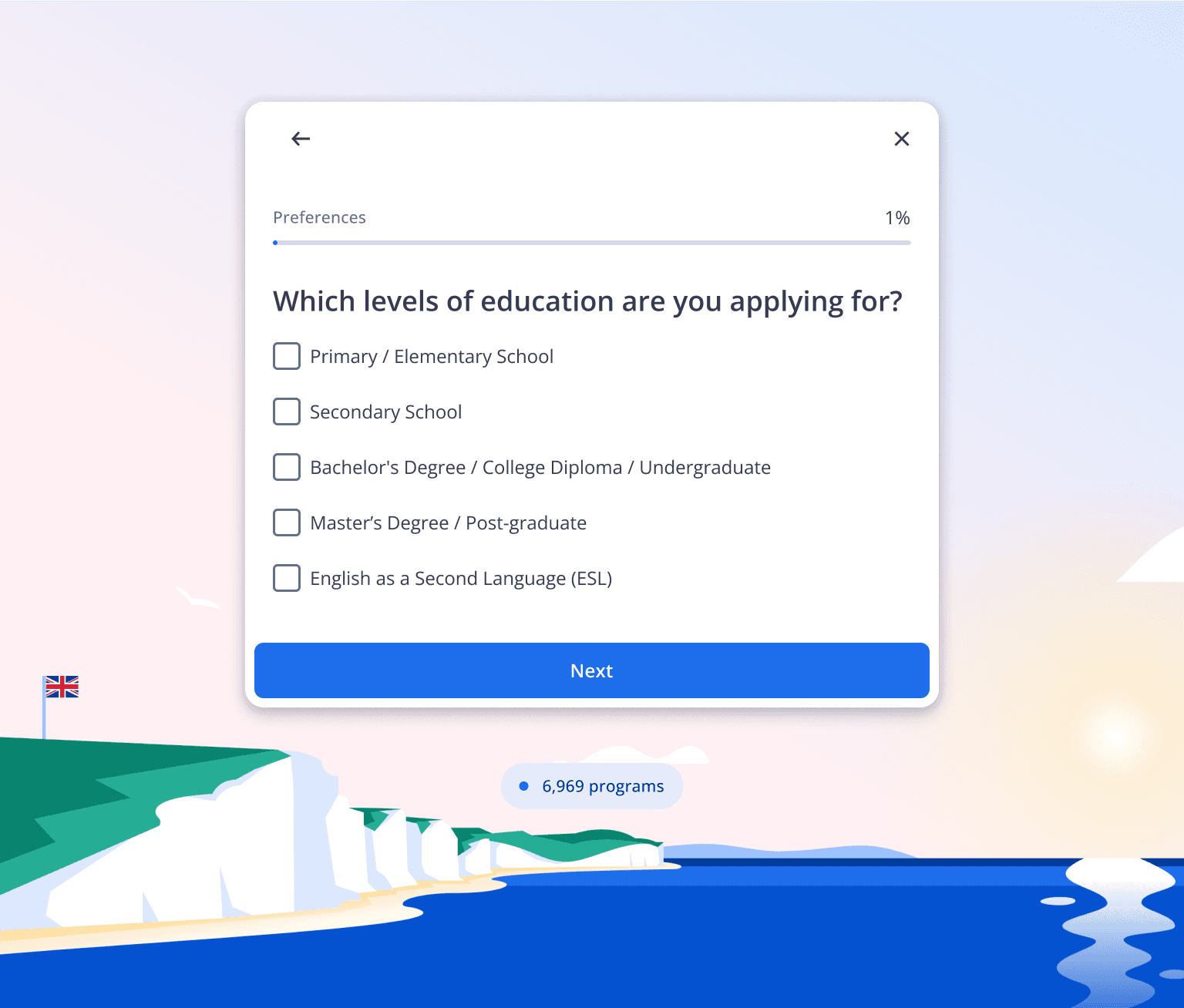
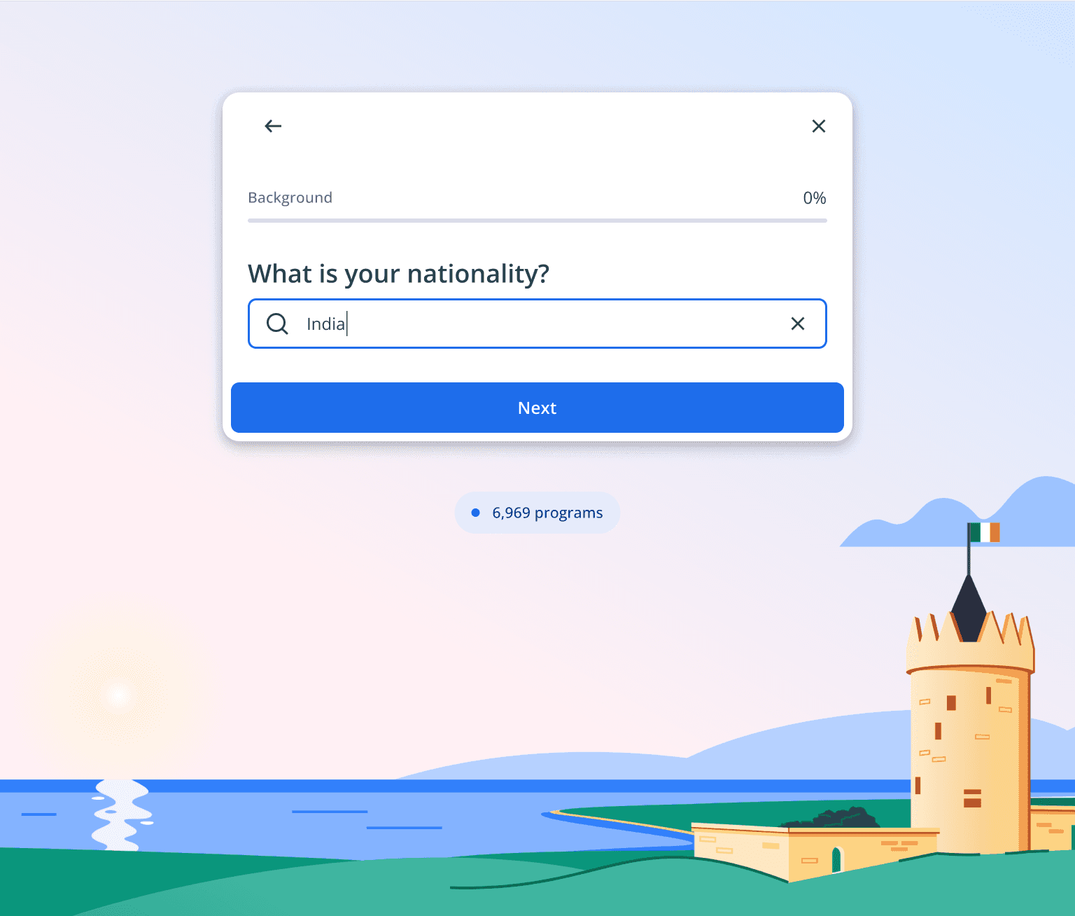
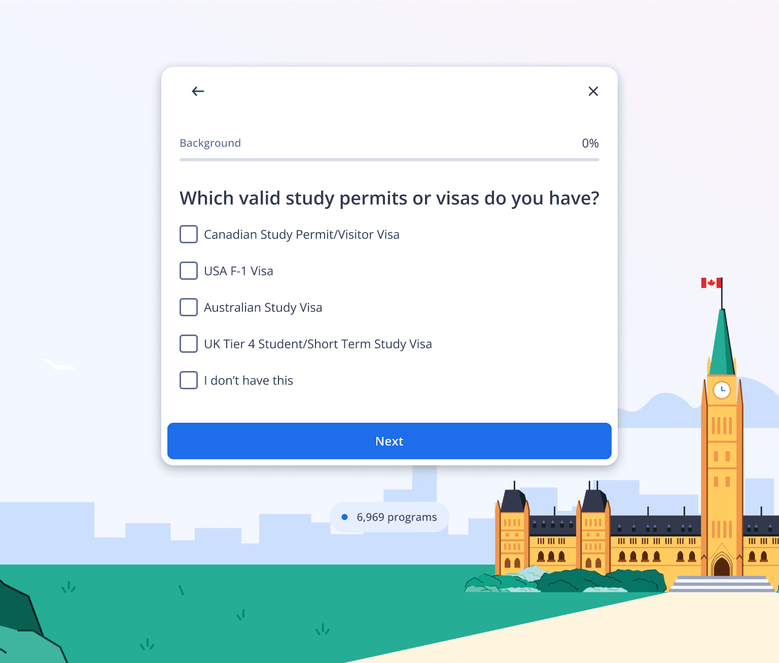
The idea was that once students identified their destination countries in the second set of questions, the backgrounds of those countries would take turn to change in subsequent questions. With the help of our creative team, we designed beautiful graphic backgrounds featuring iconic landscapes of these destination countries.
Students choose Canada, Ireland, and the United Kingdom as their desired countries in the first question and then see the background changing to those respective countries in the following questions.
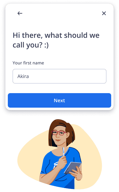
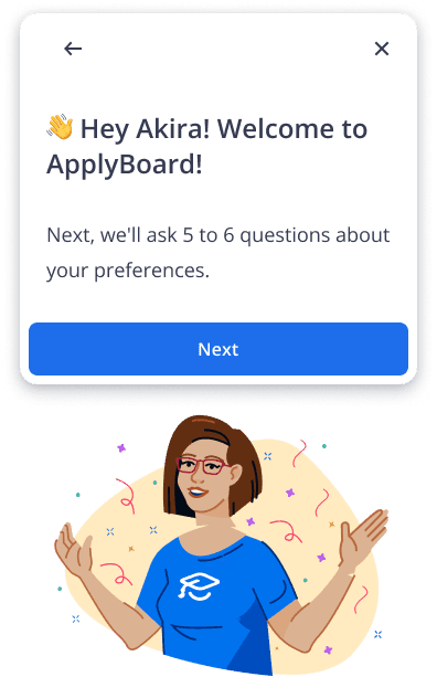
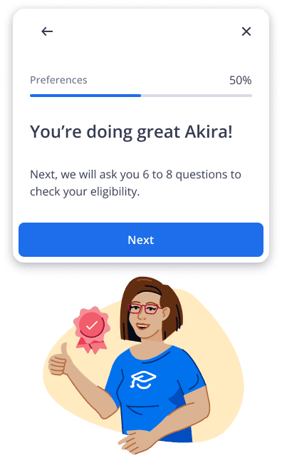
Personalized address and encouragement were also added to motivate students
Following another round of accessibility review with the UI engineering team, I refined and finalized the prototype before handing it off to the development team.
LAUNCHED & LEARNED
Our effort paid off with positive results after a few months
Insight collection
Although the onboarding process is longer, it includes essential questions that aid in defining the appropriate program for each user. This was validated after several months of development and QA testing. Eventually, we launched the new onboarding flow and achieved positive results.
Additionally, the program results were re-adjusted from the back end, making our recommendations more accurate to the students' needs.
80%
Users successfully completing this onboarding flow
85%
Accuracy of program result recommendations
10%
Decrease in time taken from finishing the flow to sign up
⏪ Looking back
Pain
❌ The language used was still challenging for international students.
❌ Program results still cannot be guaranteed to be 100%.
Gain
✅ Leveraged my content strategy skills in the revamp project.
✅ Learned how to handle various suggestions while remaining steadfast in my decision.
✅ Learned how to lead a cross functional design initiative.
⏩ Looking forward
⭐ Utilizing my newly learned skills for other challenging projects.
